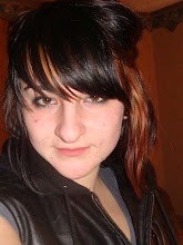
ok so this is what i have for photos so far. the bottom 2 i can't decide on, the only problem with the one second from the bottom is the huge glare on the door from the flash. so i don't know about that.
Sarah- be careful that your images don't come across as too snapshot-like. Each scene should be carefully planned: the lighting, the composition, etc. I like the note from your dad, but that may be too literal (if the text wasn't there, would you still know what the picture was about?
i agree about the flash, but i think it could easily be edited and that you could then use that photo. i like the second image a lot. also, maybe look at the compostion, especially on the first one. i think it could be fixed by cropping. i do think that your photos are pretty unified though!
i REALLY like the last one, i like where it's blurred and where it's focused, it just seems to work better, and there is better positioning of negative space,
the only thing I'd change is get rid of the flash behind the woman's head with the clone stamp, it will make it less distracting!
i really like how you used the same color tones for each photo. they really go good together as a series. out of the bottom two, i like the bottom one.
i like the last picture, alot of your dog licking your mother. its really strong, and i think it shows a different type of love. of course its a dog! we dont lick people! but. i really like the theme, of this. i think its really litteral though. but theres also really that would be not so literal. or maybe do like, how people show they love eachother by, careing, or by doing things for other people. i dont know. but good job.


 ok so this is what i have for photos so far. the bottom 2 i can't decide on, the only problem with the one second from the bottom is the huge glare on the door from the flash. so i don't know about that.

8 comments:
sarah, in the second to last one, i think that the flash is too strong, so if you were to choose between the bottom two, than the bottom one for sure!
Sarah- be careful that your images don't come across as too snapshot-like. Each scene should be carefully planned: the lighting, the composition, etc.
I like the note from your dad, but that may be too literal (if the text wasn't there, would you still know what the picture was about?
i agree about the flash, but i think it could easily be edited and that you could then use that photo. i like the second image a lot. also, maybe look at the compostion, especially on the first one. i think it could be fixed by cropping. i do think that your photos are pretty unified though!
i REALLY like the last one, i like where it's blurred and where it's focused, it just seems to work better, and there is better positioning of negative space,
the only thing I'd change is get rid of the flash behind the woman's head with the clone stamp, it will make it less distracting!
i really like how you used the same color tones for each photo. they really go good together as a series. out of the bottom two, i like the bottom one.
I like the first picture of the not your dad wrote you. I think it stands out a lot, but I like the newspaper in the background.
i like how similar your pictures are [with the color].
but i agree with the comments on the composition.
its too center.
i like the last picture, alot of your dog licking your mother. its really strong, and i think it shows a different type of love. of course its a dog! we dont lick people! but. i really like the theme, of this. i think its really litteral though. but theres also really that would be not so literal. or maybe do like, how people show they love eachother by, careing, or by doing things for other people. i dont know. but good job.
Post a Comment